Brand identity · Client · 2026
Taratan Time
A football brand that feels like match day, from the full logo down to the phone icon.
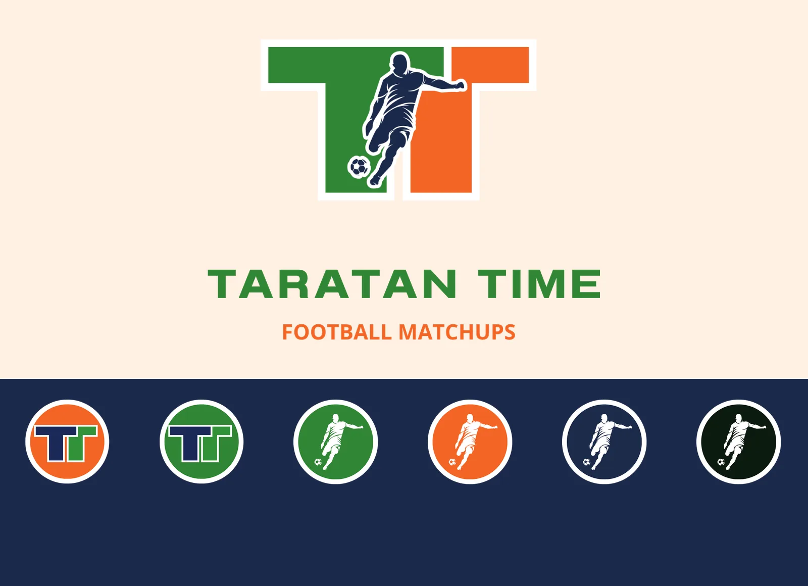
The idea
Taratan Time is about football matchups, so the logo had to feel like kick-off: fast, loud and easy to spot on a small screen.
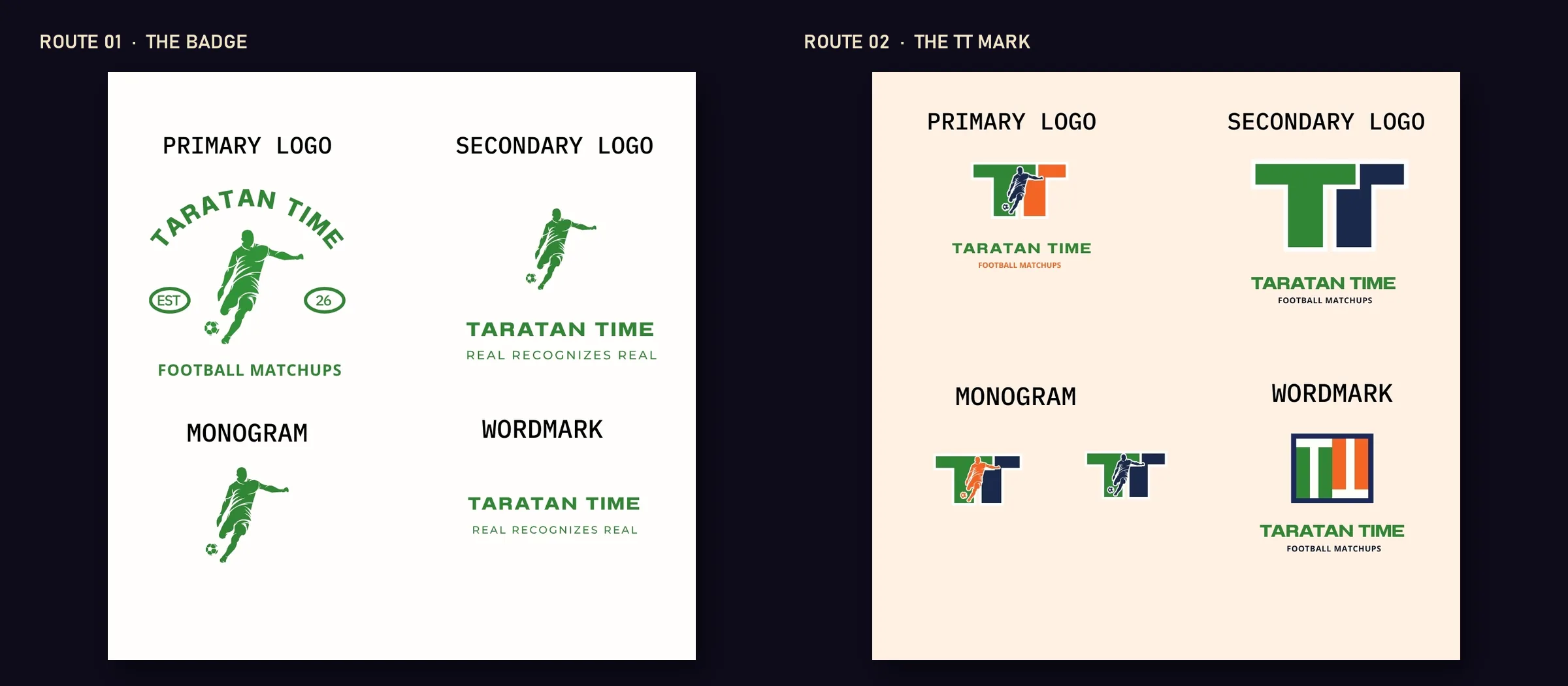
There are two routes. Route one is a classic badge with the name arched over a player silhouette. Route two puts a player silhouette inside a bold TT, so the two letters and the kick read as one shape.
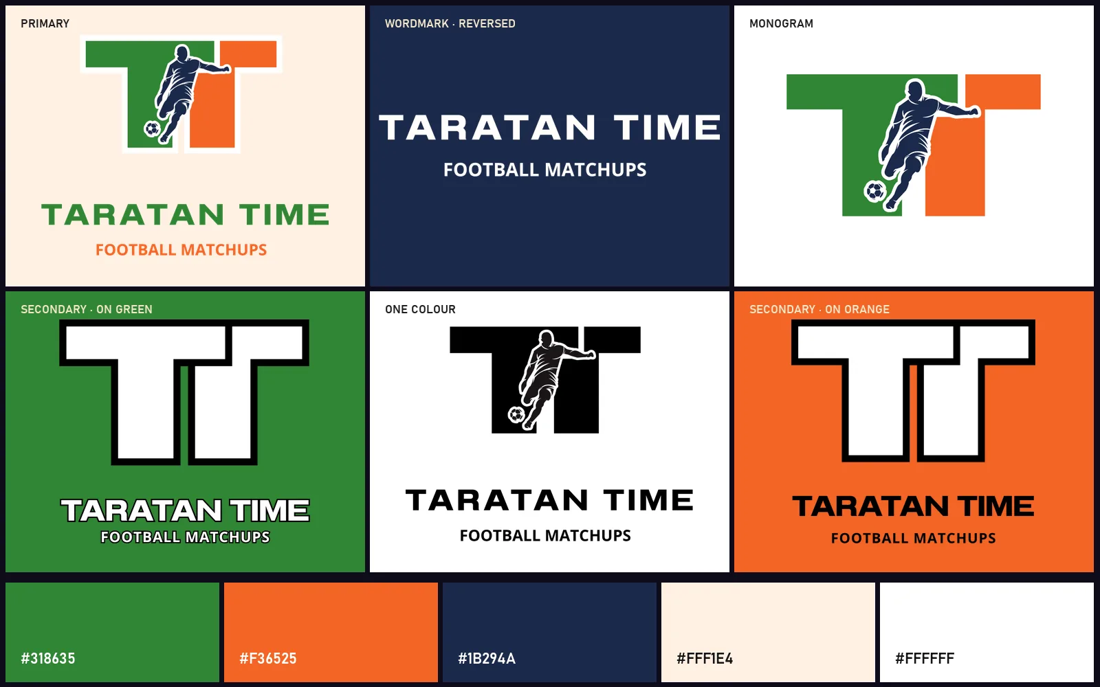
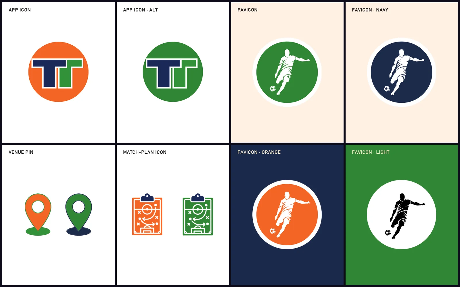
Every version was then prepared for real use: full colour, one colour, white on dark, a short wordmark, and small icons that still read at the size of a browser tab.
What was designed
- Two logo routes to choose from
- Primary logo, secondary logo and TT monogram
- Wordmark with the line “Football matchups”
- Colour, black and white versions
- App icons and favicons in five colourways
- Map pin and match-plan icons
- Colour palette: pitch green, kit orange, navy
Need something like this?
A logo that works on a sign, a screen and a 32-pixel icon. Tell me about your team, club or event.
Start a project →